This is the 2nd of 3 guest posts by SEO Guru Alex Miranda. If you missed the first post on the Google mobile friendly website requirements, read this first.
Unless you have been living under a rock, by now you already know about the Google friendly mobile update. Any website, which is not mobile friendly, will drop in rankings when searching from a mobile device. The update does not affect searches done on a desktop or a tablet. However, I do expect Google to expand this update to include a drop in rankings across all devices.
If you are using WordPress, you may be in luck. Continue reading below to learn more about the mobile friendly update and WordPress.
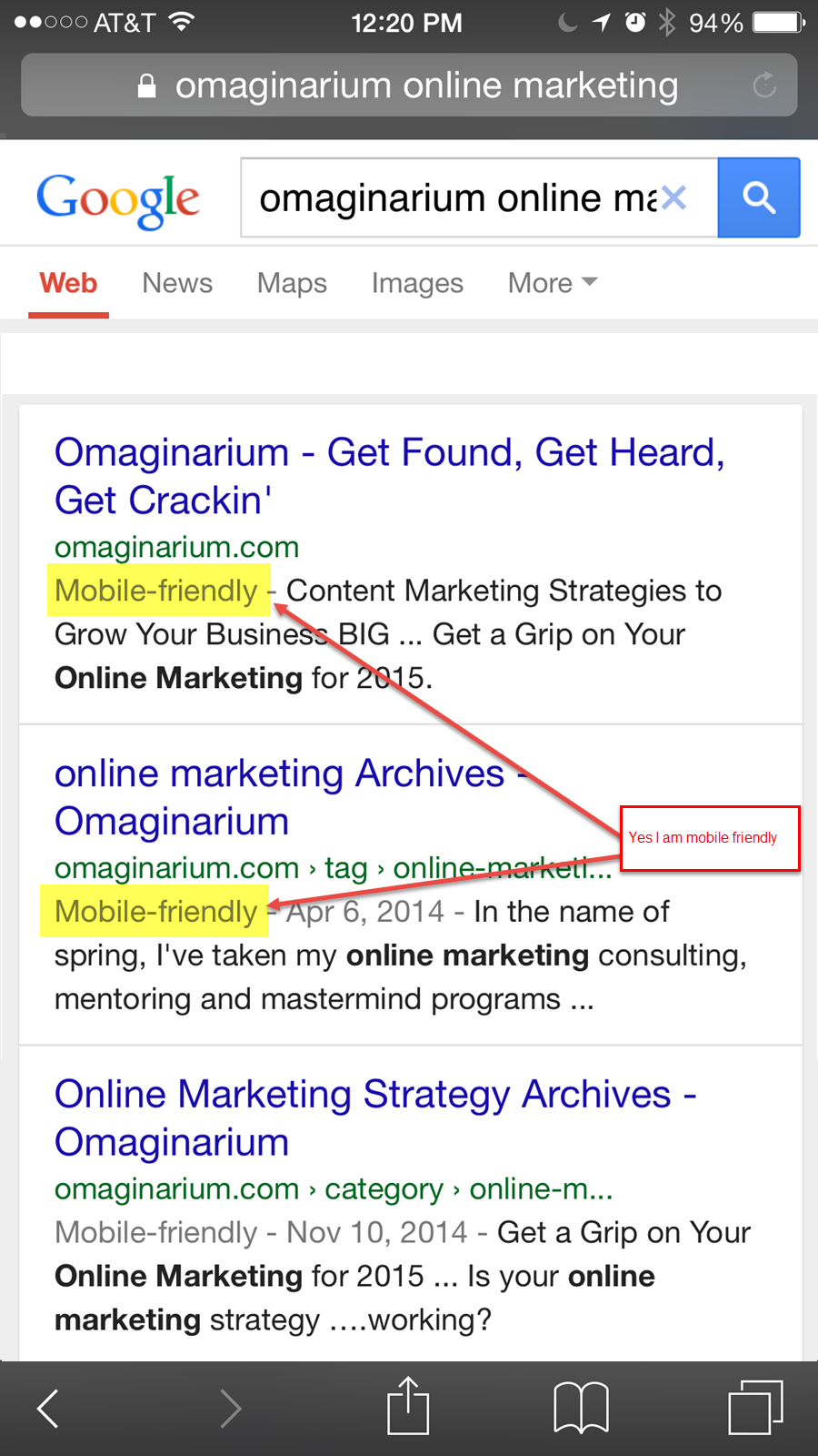
Google has started annotating mobile friendly websites on mobile search results. The example below shows you how it looks on a mobile search result.
If you own a website which was verified by Google webmaster tools, you may have received and email from Google letting you know the site has mobility issues.

If you received the email, then you have some work to do. If you didn’t receive the email, you either have a website which is mobile friendly and has no issues, or your website is not verified by Google webmaster tools. Another reason could be, you have a development team which verified the website using their Google login credentials. *Side note – Always make sure your website is verified using your Google credentials and not your developers.
Below is a step by step guide on what to do if you own a WordPress website which Google considers not mobile friendly. I say Google considers not mobile friendly because your website may be mobile friendly, yet Google is saying otherwise.
Step One: Is your website WordPress.com or WordPress.org?
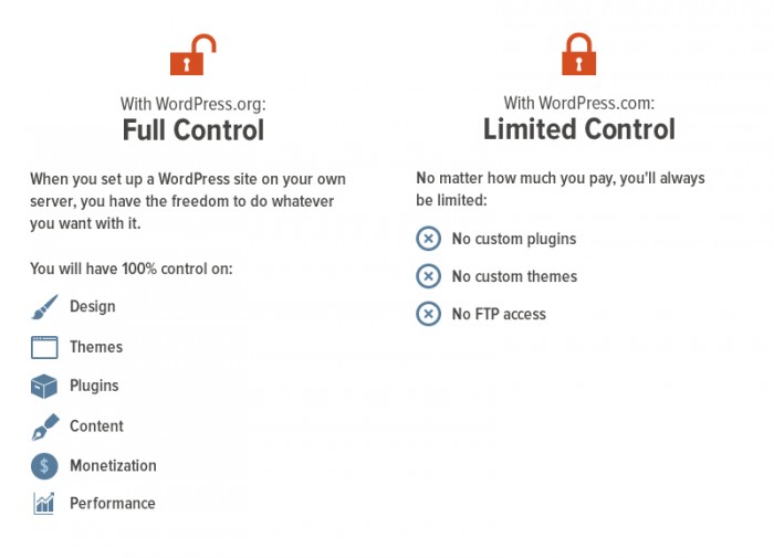
WordPress.com means WordPress hosts your site, and the good news is, they’re automatically working hard to deliver a mobile friendly theme. If you’re using WordPress.org, this means your website is self hosted. In other words, you pay for monthly hosting. WordPress itself is mobile friendly. The theme you use must also be mobile friendly. If you are using WordPress.com, chances are your site is mobile friendly already. If you have an old theme , chances are it’s not.
Step Two: Backup & Update
Make sure you backup your entire website. Find out what version of WordPress you are using. The version can be found on your administrative back end, under the Dashboard option on the left hand side. Make sure your theme is updated.

Step Three: Check your website Using Mobile Friendly Testing Tool.
Google tries to make it easy for you with this mobile friendly testing tool. This test will analyze a URL and report if the page has a mobile-friendly design. If you ran this test without updating WordPress or your theme, try running it again once you update both.

The tool does have some issues and sometimes can deliver a false negative or even a false positive. For example, a client called and told me the test said her website was not mobile friendly. We knew it was an HTML 5 responsive website. After I looked at the backend of the website, I found the issue. The robots.txt were blocking the CSS files. Once I removed the CSS disallow, I ran the test again and her site was mobile friendly. You can read about the Robots.txt files here.

Note: If you have no idea how to do step two or how to change your robots.txt settings, I advise you to stop and delegate this task to an expert. If you want to try this yourself, WordPress offers both support and documentation. I would create a carbon copy of the website and try it on development mode first.
Step Four: Checking errors on Webmaster Tools
View a report of the non-mobile-friendly pages found on your site, and the issues discovered. Go to your Webmaster Tools account dashboard > on the left side, click on Search Traffic > click on Mobile Usability. Here you will see the errors Google found. If you have a WordPress developer, have them fix the issues listed on Webmaster Tools. If not, feel free to reach out to us and we can help.

Step Five: Updating your theme
Chances are you’re using an older out of date theme. Let’s update it. You need to take advantage of a new more responsive layout on both desktop and mobile devices which adapts to every type of browser it encounters using the same HTML, CSS, and JavaScript code.
- Check if the theme you are currently using has an update available, and if that update is mobile-friendly.
- If an update is available and it is mobile friendly, it may be all you need to do. An additional benefit to updating your theme are the security update fixes your site will receive.
- Once your theme is updated, use the mobile friendly testing tool again. You should pass with flying colors.
If it does not work, it could be the updated theme is not mobile friendly. Read on.
Step Six: Choosing a new theme
If you are choosing a new theme, make sure you choose a theme only from trusted theme developers. Try to avoid FREE themes. many have issues and are not upgrade-able. Below is a list of premium theme developers.
- StudioPress – By far the most trusted premium theme website in the market today. The industry standard. Suzen uses it for her clients.
- Woothemes – Leading WordPress theme and plugin provider with tons of themes, plugins and more.
- ThemeForest – They have good premium themes which are reviewed by designers.
- Templatic – Over 60 premium themes. You can literally buy all the themes for $299. Great if you’re a developer
- Elegant Themes – Nice premium themes. $69 gives you all the themes.
These are just a few. You can also go to WordPress.org and choose one of their themes.

Step Seven: Double Check Theme
You can check how a theme works by going to their live demo. Try the live demo on both desktop and mobile devices to see if the theme works well for you.
If you don’t have a mobile device available, you can check other ways. Below are tools you can use:
- Responsonator – The Responsinator is designed to test responsive websites on different device resolutions.
- Screenfly – Test your website on any screen size including desktops, tablets, televisions, and mobile phones.
- Google Chrome – If you are using Google Chrome, there is a “mobile device emulation” feature in Chrome Developer Tools. These tools are found under the Chrome menu View > Developer > Developer Tools. It is my go to tool for checking mobile responsiveness. You can choose from any device in the market today.

Step Eight: What if you don’t want to change your theme?
There are several third-party solutions you can add that will create a mobile friendly functionality to your site. Using WordPress Plugin store consider the following options:
- Jetpack: provides mobile friendly features of WordPress.com sites to your self-hosted site.
- WPTouch: provides a separate mobile-friendly version of your site. This mobile site will display with a different theme altogether.
- WPMUDEV – Great blog post on how to upgrade your theme even if it is customized. Click here to read
There are options for customizing your current WordPress installation theme, however, this is an option for more experienced users and requires HTML and CSS knowledge, give us a call today and we can make sure you’re not missing out on the mobile traffic.