-This is the 3rd installment from SEO Guru Alex Miranda, on the new Google requirements for mobile “friendliness” and how not to be left behind. If you missed the first 2, come here , and here first.
Getting Your Website Mobile Ready and Why It Matters
It’s official, Google has just confirmed that more Google searches take place on mobile devices than on computers in 10 counties including the U.S. and Japan. Smartphones have become personal shopping assistants for most people. If you want to go or if you want to buy, it’s all right on your fingertips. As of today, Google is rolling out a beta version of a mobile car showroom. Car dealers across the country can sign up for this new feature which will essentially allow you to build your car right from the search engine results page and order it. They also released new shopping and hotel booking updates which will make it much easier for mobile users. This matters big time. Recent Google update made ‘mobile-friendliness’ a phrase on everyone’s lips. Or at least, upon the lips of everyone who owns a website. The update allows Google users to get relevant, high-quality search results that are optimized for their mobile devices. Let’s take a look at why it matters.
So what does this mean to you?
Let’s understand why you want your site to earn Google’s mobile-friendly seal of approval. Smartphones are now ubiquitous. More importantly, is the fact that more than half of all smartphone users research products and services on those devices. And it’s even more compelling: 93% of those users will end up making a purchase. Yes that is 93%. These are numbers business owners cannot ignore.
As you probably know, mobile surfers aren’t keen on scrolling through pages and zooming in on text. If your site is not optimized for mobile viewing, a whopping 61% of mobile visitors will abandon your site and head for a competitor with a more mobile-friendly site. That is, of course, if they even find you online.
With Google’s new algorithm, sites that rank well in mobile-friendliness get a boost in mobile search engine listings. Those that don’t, won’t. Long term, this may end up impacting desktop searches as well. Considering that 75% of web searchers never look beyond the first page of results, sites that rank lower are not being seen by a significant portion of their potential audience.
In other words, if your website is not currently mobile-friendly, you’re missing out on website traffic, leads, customers, and sales.
If your site didn’t get a mobile-friendly make-over before Google’s update, you can still take action to get back into Google’s good graces.
Here is what you need to do today:
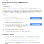
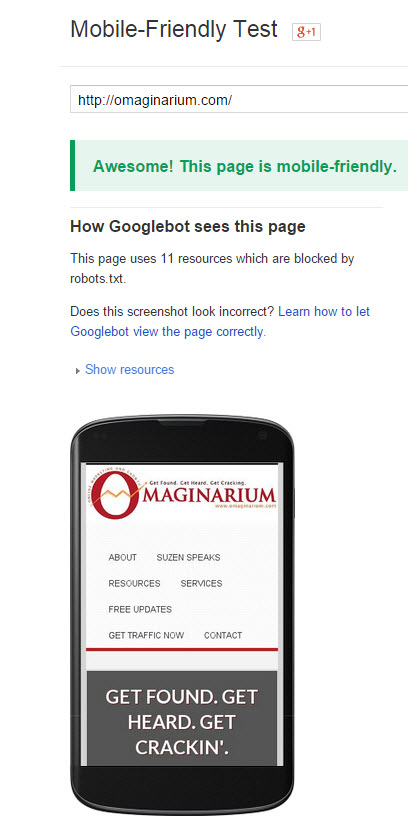
1. Take the mobile friendly test.
First, let’s find out if your site is mobile-friendly. Just enter your web address on Google’s Mobile-Friendly Test page and let the bots do the investigation for you.
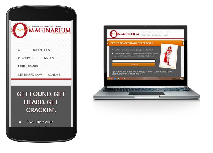
2. Create a responsive website
Responsive design sends the same HTML to every device that adapts to every type of browser it encounters using the same HTML, CSS, and JavaScript code.
In plain language: If you were to go to your site up on your phone right now, the view would be appropriate for the screen width and the content would be readable. If you hadn’t created a responsive site, the browser would have assumed your page was intended for desktop width and the page would have been scaled accordingly. That yields an unreadable website, and will likely result in a poor user experience and a high rate of site abandonment from mobile devices.
3. Switch to WordPress and use an HTML 5 mobile-friendly theme
If your site is not already built on a WordPress platform, consider making the switch. Among other benefits, you’ll have a deep reservoir of HTML 5 mobile-friendly themes from which to choose. Already have a WordPress site? Maybe it’s time for a make-over. If you’re using an older theme, check for an update. The newer version of your existing theme may be enough to solve any mobile unfriendliness issues that currently exist. Alternatively, you could opt for a total refresh and find a more current, responsive theme for your site.
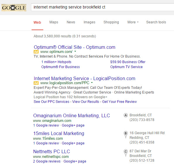
4. Optimize for local search
Think back to the last time you were out of town on vacation or business. All you wanted was a good cup of coffee; if only you knew where to find it. “Wait, why not search for local coffee joints on your phone!” Sound familiar? Of course it does. Did you know roughly 20% of mobile searches are for local resources? Be ready for it. You can optimize your site local search listing by taking these few simple steps.
• Make sure your website is listed on Google, Yahoo, and Bing’s local sections. When pulling results, each of these search engines have a special section for businesses with a physical address in the city from where the user is searching. These results appear at the top of the organic results, just below the paid lists. In other words, your site may be the first thing your potential local customer sees.
• Complete your business page profile on Google+. Many Google+ pages receive tens of thousands (and some in the millions) of views. You want to be sure that your profile accurately reflects your brand and your messaging.
• Register for other local listings and apps including LinkedIn, Best Of The Web, Yelp, Apple Maps, InfoGroup and Yellowbook.
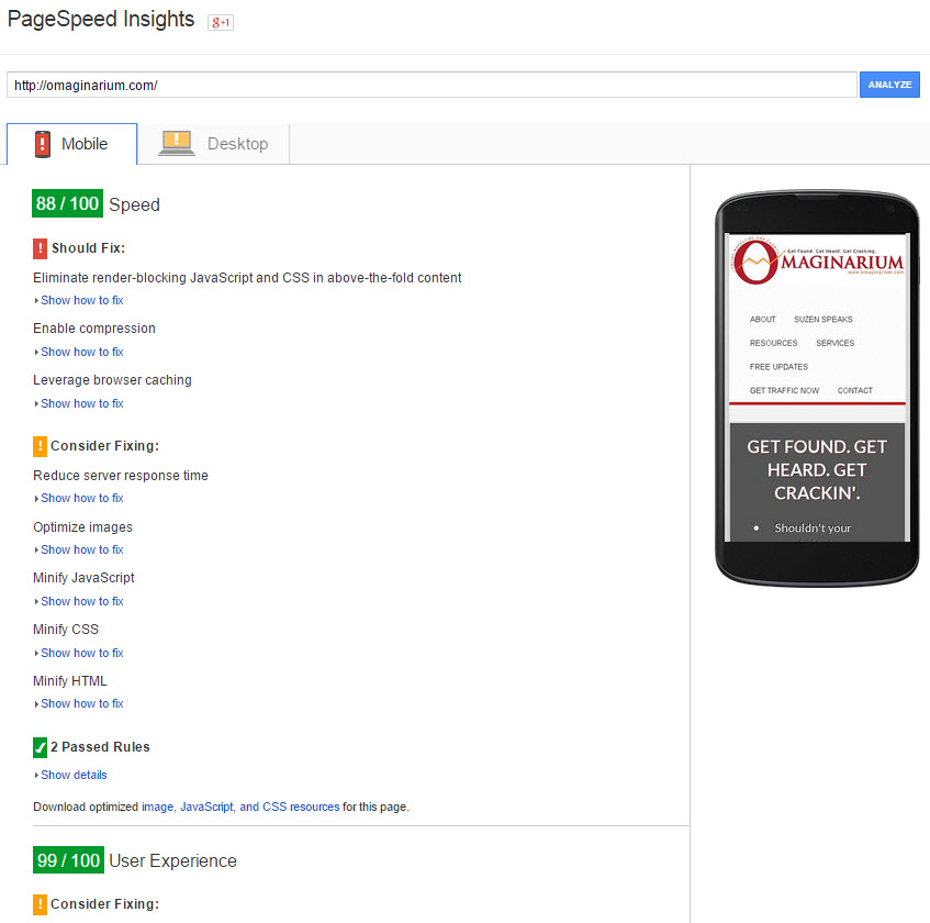
5. Make Sure Page speed is….speedy
Slow loading pages can frustrate site visitors. More important, however, is that they can negatively impact your mobile-friendliness. Start by optimizing your images and limiting the number of HTTP requests. Not sure if your page has speed issues? Google has an app for that. Run your page through Google PageSpeed Insight. It will tell you where your sight can be improved and how you can go about doing implementing the improvements. When your report comes back, pay specific attention to the “Speed” section. Focus on the “Should Fix” issues. Making changes to these items will give your page a speed boost.
6. Create a mobile app
Make it easy for your mobile visitors to do business with you by creating a mobile app. For example, restaurants are using www.chownow.com to give customers the ability to place orders right from their mobile phone. In fact, Chownow has partnered with Apple Pay and Google Wallet, so hungry customers can order with a tap of the finger and pay straight from their phones. This can be a standalone app, as well as a function embedded into your website or Facebook page. Can you imagine? Here, we’ll make it easier, check out what Aversano’s, in Brewster, NY is doing with it: http://www.aversanosrestaurant.com/
Feeling a little overwhelmed? no need to worry. Contact me directly and I can help you get your website mobile optimized. Not using WordPress?
It’s time