Welcome to the 6th in the Monday Marketing Masters series, bringing you my take on the best of the best marketing and branding strategies out there today. Still chugging!
I was watching a TED talk today on a topic only a geek like myself would be attracted to, I thought…until, it occurred to me that, nope, this simple strategy is a mostly untapped opportunity for small businesses and marketers, myself included, (and I need to get on this. So do you). Then I got a little OCD and decided to hunt down some of the best, funniest, most creative and smart 404 pages out there now. It occured to me that a 404 error page can be the best marketing strategy around, or at least a component of it.
When you are finished reading, this your homework is to create one for your own site or blog and to report back with what you’ve come up with. They’re not hard to create. I’ll show you mine if you show me yours. Really.
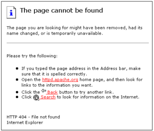
First lets explain for anyone who doesn’t know, what a 404 page is. A 404 page is that annoying page you occasionally stumble on that tells you that you’ve either typed in a broken link, an incorrect URL, or a non-existent page on a website.
They usually go something like this:
Typical 404 page-you’ve seen them:
Here’s the thing in a nutshell—what a waste of space! What a missed opportunity! What a space just crying out for creativity, re-directs and a cool marketing message!
So today’s Monday Marketing Masters is not pegged to one company, but rather takes examples from a few. I’m calling out what I have found in my over-zealous search to be some of the best, funnies and coolest 404 pages. Feel my ferver:
1)Campbells- look at what Cambells has done here, carried over their branding as well as a play on the warm and fuzzy branding line Uh-Oh Spagettio’s. I doubt that anyone reading my blog is too young to remember this;
2) Ever-so-smart eHarmony includes a call to action with their message. ‘So you can’t find the page you’re looking for? As long as you’re here why not sign up?’ Simple to add a call to action form in a 404. And smart
3) Emailcenter, from the UK has this brilliant, interactive 404 page where you get to choose who to fire for messing up and creating the broken page. Check out the live version here: it’s fun and funny
4) Just funny:
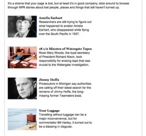
5) NPR’s 404 error page lets you in on the fact that there are other things that haven’t shown up as well:
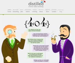
6) A company’s cute animated discussion telling you that you need to contact them to tell them of the 404 error. Good idea, right?
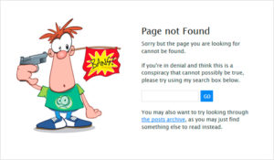
7) This guy has a search bar embedded into the 404 page, and instructs you to look again for what you want. (And perhaps you’ll find something that you catches your interest along the way). Guides you to search their website:
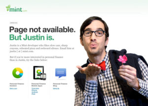
8) Oh Justin. He’s cute but not as slick as this 404 page that re- directs you to either Mint.com’s home page, mobile apps, or their blog. Just in case you’re not interested in Justin
9) Now this is fancy. It’s a 404 video. I saved it for last because it’s just so clever, and hilarious. And because Guy Kawasaki likes it, so how can it be bad. Here’s the link to the actual video at visitsteve.com
The moral of the story is what Renny Gleeson talks describes in his Ted talk and gives us an example of with Athletepaths big ooops. Following the ooops, Athletepath realized it had a great opportunity with the video of said ooops, and they embedded it into their own 404 error page. Without using creativity to re-imagine the 404, the error page only tells the visitorIt that you’re experience is broken…It’s sad. Annoying. Your pissed. Might not come back.
But well designed errors, just like errors we make in life, in building our businesses, and in general for that matter, can build relationships, and by doing so, build our brands.
Like this? Have examples of your own of marketing mastery? Have you seen the rest of the Monday Marketing Master Series? Catch up, man! …woman!

