I’m not a Game of Thrones fan yet…simply because the last thing I need is another addictive TV series to get sucked into, and because I’m still mourning the Breaking Bad finale. My drama quotient has reached critical mass.
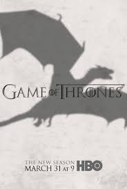
That being said, HBO’s Game of Thrones season 3 wins ‘Best Use of Visual Marketing’ in my book, and came this close to almost having me as a convert, with its use of the mysterious dragon shadow at the core of its branding. It’s the geek in me. And I couldn’t be farther from a dungeons and dragons girl.
Its subtle, yet alluring visuals for the upcoming season first seen in its poster and in all the magazines built momentum for its upcoming premiere, where HBO was making a concerted effort to transform the cult favorite show into a more mainstream experience, to attract a wider audience. ( of course). Witness:
Then came its print ad spread in the NY Times, where the dragon hovers over the 2 page fake news story, luring the reader to stop, take a moment and figure out what is going on. Masterful
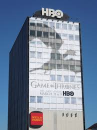
And finally, if you were in LA you could have also seen the haunting dragon front and center, flanking the HBO building
By the time the season premiere hit, it took a lot of will power to hold me back from lunging head first into the series.
There are times when words lose out to the impact of the powerful image, drawing you in emotionally, using the most unexpected and innovative mediums; which we can now create with all kinds of IT tricks of the trade like Vine, creative branding apps ,and video, and as we see here, the simpler, yet oh so powerful stand alone branding image that HBO uses.
Were you sucked in to Games of Thrones through this campaign…that seemed to be everywhere?


